
Est. reading time: 10 minutes
Main tool used: Google Sheets (or Excel). Link to example used at the end.
Short intro: The web analytics metrics can increase and decrease every day.
Sometimes it can get difficult to know if a positive or negative change is significant or not. People can panic too early when there is a decrease or get too excited when there is a positive change without considering the data context and statistics.
I will use a demo example with a weekly graph. (data is fictive)
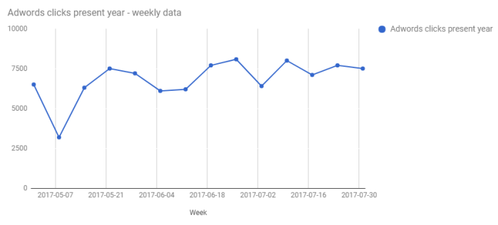
We can see in the graph above changes in the numbers (positive and negative). Without adding a context we can’t understand or easily explain the changes.
3 factors can help on understanding the data changes
1. Available historical data.
Benefit: See trends in seasonality and impact from other changes
2. Statistical context by adding a standard deviation calculation to the data.
Benefit: It can provide confidence in the significance of change
3. Data visualization
Benefit: Creating a clear graph can help on making the decision to roll back a change or not. (as long as it is easy to understand)
1. Historical context
1.1 After choosing the metric, get historical data from at least 1 year.
( The historical data can help with showing the seasonality trends. I added in the example a column with “Adwords clicks last year”)
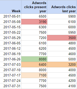
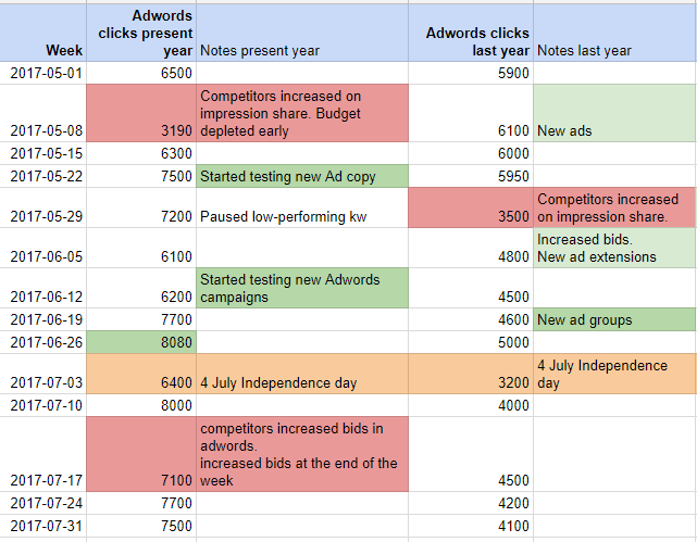
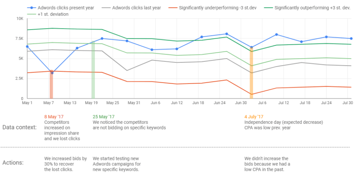
1.2. Add columns with notes for data context and configure the colours as you wish.
The notes can help with correlations on outliers.
2. Statistical context
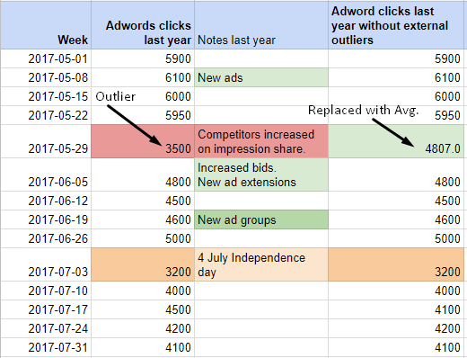
2.1. Clean data from external outliers and check for normal distribution
To see only significant changes, exclude from the calculations outliers from the previous period that shouldn’t normally happen in the present.
For example, if we had a past period where we are sure the problem was fixed like a server error in the past and we don’t expect the same problem in the current period then we could exclude that interval and replace it with the average value.
For this you can use the Average() function on the data points excluding the outlier point with fixed issues. You can add the average number instead of the outlier for more accurate references.
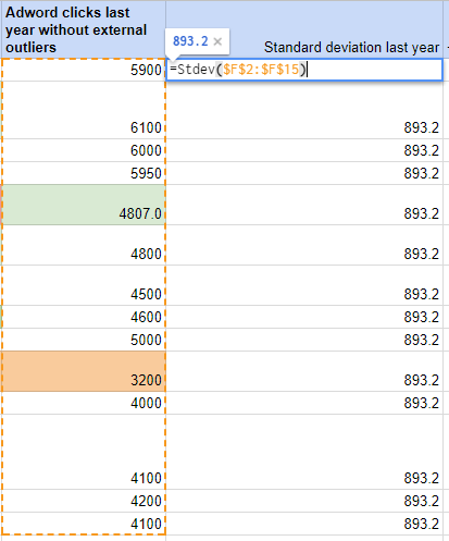
In the example I added a column “…without external outliers”
Excluding outliers is also suggested to generate a normal distribution.
I have used this calculator here to check for normal distribution.
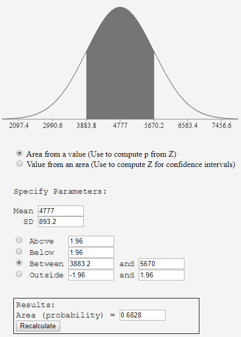
2.2. In Google sheets (or Excel) use the STDEV function to get the standard deviation from all the historical values of the selected metric from previous year without external outliers.
I prefer using Google Sheets because it’s more easy to share compared to Excel.
In the example I used STDEV(F2:F15) where F2:F15 is the interval from last year.
2.3. Create the deviations columns to see context year on year.
Add the columns with 1 or more deviations for prev. Year.
This way it will be more easy to compare numbers on current year vs. previous year.
3 standard deviations above or below = clear sign of change for any single point!
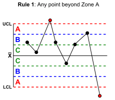
2 standard deviations above or below = outperforming/underperforming sign
Note (Western Electric rules):
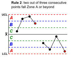
if there are 2 out of 3 consecutive points on the same side this is a significant change
1 standard deviation above or below = acceptable.
Note (Western Electric rules):
If there are 4 out of 5 consecutive points on the same side then this is a sign of a significant change.
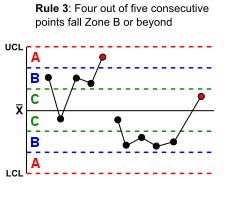
If you are curious about the statistical conditions details for the graphs above see the Western Electric rules.
3. Create the graph and use a clear colour coding.
I added colours that are easy to understand (from dark red to dark green)
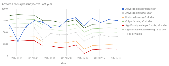
The main colours that show significant clear changes are dark green and dark red.
There was an increase signal vs. previous year by having 4 out of 5 consecutive points at over 1 standard deviation (the increase started at over 1 st. deviation at week 22.05.17)
The week starting with 19.06.17 is significantly outperforming at +3 st. deviations last year.
Dark green for the significant outperforming numbers with 3 standard deviations above
Dark red for significantly underperforming -3 st. deviations.
Other colours:
Orange for underperforming that needs attention at -2 st. deviations.
Normal Green for outperforming signs at +2 st. deviations
Bright green for +1 st. deviation.
The blue lines with the dots represent the data from current year and on grey the data from previous year.
The data source example with the graph is available on Google sheets here.
(if you want to edit this document make a copy from top left menu: “File > Make a copy”)
I have also added a dashboard example in Data Studio with Data context and actions to understand better the causes of the changes in the numbers.
References:
Leverage statistical control limits – Avinash Kaushik
Standard deviation – Wikipedia
