Tools and skills people working on digital analytics are interested to learn in 2020 (based on survey data)

🕑 Est. reading time: 5 minutes

If you ask a digital analyst on how he/she would like to develop their career the person might respond with an interest to get into data modelling or data science. Sometimes a digital analyst might mention an interest to improve the skills on data visualization (using PowerBI or other tool), storytelling with data, stakeholders management, improve tag management skills (using a tool like GTM) or learn a new analytics tool. (like Adobe Analytics)

Based on my exploration, I noticed there is an overlap on some of the actions a digital analyst and a data scientist do.

A proficient digital analyst is more focused on detecting causality and test for statistical significance while data scientists are doing advanced statistical analysis, machine learning or build predictive models.

In the picture below, the actions in column 1 and 2 below can be done by a good analyst while a good data scientist can usually do actions in the columns 2 and 3.

(You can also click on picture below if you want to load it in a new tab on a small screen.)

Source

With an array of tools at the disposal of digital analysts and an even more varied range of skills digital analysts can learn, which ones are worth investing in for 2020? 

When it comes to data modelling, research shows some clear top choices: Python, R and SQL

I have created on twitter in February a short poll to see the level of interest for each and to see also other responses. From 531 votes, Python was the top choice (47.1%) followed by SQL (21.8%) and R (19.4%).

In the “Other” last option the responses in the comments included:

GCP and Azure – 2 mentions

Java, React, Julia, Adobe Analytics and PowerBI – 1 mention

I was happy to see “people skills” mentioned even it was only once but to be fair it wasn’t included in the list of options:

A study made by the McKinsey company shows that not only technological skills but also social and emotional skills will become more important as intelligent machines take over more some of the basic/repetitive tasks.

social emotional people skills

When dealing with projects that are more complex it might be useful to have a combination between curiosity, humble attitude and patience.

While some people think that a digital analyst’s role, like that of a data scientist, is mainly technical, a minimum level of communication will still be required.

This is important because the person will need to explain the results of a project or maybe to promote the project itself in a clear way.

Patience is good to learn and evolve and it can be used also when explaining to non-technical people or people who might be technical but maybe data analysis is not their main interest. If you are speaking too fast (or running too fast) people might not be able to understand you.

Proficient digital analysts or data scientists have a medium to high level of communication (they know how to communicate to non-technical people).

Regarding the Python top choice it seems that also another study shows similar results for top choice as a modelling coding language

For example, according to the latest trend search on IndeedPython is said to be the top skill for a data scientist by the percent of jobs.

Source
What skills do employers look for a data scientist?

python(79.1%)machine learning(71.6%)r(64.4%)sql(53.5%)hadoop(28.8%)spark(27.8%)java(24.8%)sas(23.8%)tableau(21.4%)deep learning(19.7%)

This is further strengthened by the fact Python is generally considered easier to learn, beats both R and SQL in terms of being a primary modelling coding language.

Source

Python also shows at the top when it comes to one of the most regularly used data science tool. Keep in mind when looking at the chart below or other similar charts that people might use a combination of tools like for example writing code in Python while using Jupiyer Notebooks and doing some machine learning with Scikit-learn.

Source

Google Trends shows a higher interest on “python data science” vs. “r data science”:

What can you do with Python ?

  • Data scraping
  • Data analysis and mining
  • Data visualization
  • Machine Learning

If you want to see an example on how you can use Python with Google Analytics data see the link here: Python and Google Analytics

————————

I have posted the poll also on Linkedin and I have received in the comments section also mentions about:

Storytelling with data – 3 mentions

GTM – 2 mentions

Data Science – 1 mention

PowerBI – 1 mention

Stakeholder management – 1 mention

If you want me to add some resources related to specific skills or tools let me know in the comments.

I might create a new article with resources if there is enough interest.

How to show users metric and goal conversion rate for users in Google Analytics

Google Analytics Demo account shows the “Users” as a primary metric by default in the reports.

Users-Demo-Account

If you want to show “Users” as a primary metric, you can do a custom report but Google Analytics has a feature to show it also in the default reports.

If your email account has the rights to make changes in the Admin section you can try the following steps:

Admin > Property Settings > User Analysis (scroll to bottom) and click on the button to activate the option from “OFF” to “ON”.

User-Analysis-off

User-Analysis


How are the reports different?

I have made a small test with 2 properties running in the same period with and without this feature enabled.

Property 1 with the Users metric option disabled

Acquisition – All traffic – Source / Medium

users-metric-in-reporting-disabled-google-analytics

Property 2 with the Users metric option enabled

enable-users-metric-in-reporting-google-analytics

As you can see we now have Users showing as a primary metric.

(For user reporting details read more here in the GA documentation)

In the example above from property 2 with user reporting enabled we can see that the default goal conversion rate is still calculated to sessions not users.

Calculated metrics related to users

If we want to update also the Goal conversion rate for users we need to add a calculated metric.

Location to add: Admin > View > Calculated metrics

Calculated-metrics-view

You will need to add a name , choose Percent on Formatting Type and add the formula dividing goal completions to users.

calculated-metric-google-analytics

Formula example with Goal completions divided to users

calculated-metric-formula-users

After creating the calculated metric you can add it for example in a Custom report.

Goal-conversion-rate-users-custom-report

Custom report example with Goal conv. rate for users

Users-goal-conversion-rate-custom-report

How to check if an indicator changed in a significant way by adding historical and statistical context

Est. reading time: 10 minutes

Main tool used: Google Sheets (or Excel). Link to example used at the end.

Short intro: The web analytics metrics can increase and decrease every day.

Sometimes it can get difficult to know if a positive or negative change is significant or not. People can panic too early when there is a decrease or get too excited when there is a positive change without considering the data context and statistics.

I will use a demo example with a weekly graph. (data is fictive)

Adwords-weekly-data

We can see in the graph above changes in the numbers (positive and negative). Without adding a context we can’t understand or easily explain the changes.

3 factors can help on understanding the data changes

1. Available historical data.

Benefit: See trends in seasonality and impact from other changes

2. Statistical context by adding a standard deviation calculation to the data.

Benefit: It can provide confidence in the significance of change

3. Data visualization

Benefit: Creating a clear graph can help on making the decision to roll back a change or not. (as long as it is easy to understand)


1. Historical context

1.1 After choosing the metric, get historical data from at least 1 year.

( The historical data can help with showing the seasonality trends. I added in the example a column with “Adwords clicks last year”)

Historical-data

1.2. Add columns with notes for data context and configure the colours as you wish.

The notes can help with correlations on outliers.

Notes-adwords

2. Statistical context

2.1. Clean data from external outliers and check for normal distribution

To see only significant changes, exclude from the calculations outliers from the previous period that shouldn’t normally happen in the present.

For example, if we had a past period where we are sure the problem was fixed like a server error in the past and we don’t expect the same problem in the current period then we could exclude that interval and replace it with the average value.

For this you can use the Average() function on the data points excluding the outlier point with fixed issues. You can add the average number instead of the outlier for more accurate references.

In the example I added a column “…without external outliers”

Outlier

Excluding outliers is also suggested to generate a normal distribution.

Reference here

I have used this calculator here to check for normal distribution.

68-normal-distribution

2.2. In Google sheets (or Excel) use the STDEV function to get the standard deviation from all the historical values of the selected metric from previous year without external outliers.

I prefer using Google Sheets because it’s more easy to share compared to Excel.

In the example I used STDEV(F2:F15) where F2:F15 is the interval from last year.

Standard-deviation-adwords

2.3. Create the deviations columns to see context year on year.

Add the columns with 1 or more deviations for prev. Year.

This way it will be more easy to compare numbers on current year vs. previous year.

3 standard deviations above or below = clear sign of change for any single point!

230px-Rule_1_-_Western_electric_control_chart

2 standard deviations above or below = outperforming/underperforming sign

Note (Western Electric rules):

if there are 2 out of 3 consecutive points on the same side this is a significant change

230px-Rule_2_-_Western_electric_control_chart.png

1 standard deviation above or below = acceptable.

Note (Western Electric rules):

If there are 4 out of 5 consecutive points on the same side then this is a sign of a significant change.

230px-Rule_3_-_Western_electric_control_chart

If you are curious about the statistical conditions details for the graphs above see the Western Electric rules.


3. Create the graph and use a clear colour coding.

I added colours that are easy to understand (from dark red to dark green)

Adwords

The main colours that show significant clear changes are dark green and dark red.

There was an increase signal vs. previous year by having  4 out of 5 consecutive points at over 1 standard deviation (the increase started at over 1 st. deviation at week 22.05.17)

The week starting with 19.06.17 is significantly outperforming at +3 st. deviations last year.

Dark green for the significant outperforming numbers with 3 standard deviations above

Dark red for significantly underperforming -3 st. deviations.

Other colours:

Orange for underperforming that needs attention at -2 st. deviations.

Normal Green for outperforming signs at +2 st. deviations 

Bright green for +1 st. deviation.

The blue lines with the dots represent the data from current year and on grey the data from previous year.

The data source example with the graph is available on Google sheets here.

(if you want to edit this document make a copy from top left menu: “File > Make a copy”)

I have also added a dashboard example in Data Studio with Data context and actions to understand better the causes of the changes in the numbers.

Data-context-actions

References:

Leverage statistical control limits – Avinash Kaushik

Standard deviation – Wikipedia

Statistical context to reports

Statistics in Web Analytics

Tools to enhance data quality for Google Analytics

1.  Remove spam traffic in GA

You can exclude each spam source by hand but if you want to try an automatic way to do this there are tools that can help.

spammy

The tool with the biggest list of spam websites I have found so far is GA Referrer Spam blocker (free).

Alternatives:

Search Commander Spam filters (free)

Simo Ahava Spam Filters (free)

How you can use a GA Spam filters tool:

Click the main call to action on the page and select your Google Analytics Account where you want to apply the filters.

The tools will also ask for permissions to add these filters before starting the process.

2. Get unsampled data

Suggested tool: Google Analytics for Spreadsheets (free tool)

10000-rows-no-limit-google-sheets-google-analytics

To unsample the data you will need to select Sampling level : Higher_Precision

See this tutorial for more details to remove sampling

Alternative tool: Supermetrics for Google Drive (paid pro feature)

supermetrics-table

Alternative tool 2: Analytics Canvas (free trial)

Analytics Canvas can reduce or eliminate sampling by using query partitioning.

3.  Table Booster

The Table Booster for Google Analytics is a small plugin that can help a GA user to analyse the performance of a dimension (for example a source) on one or multiple metrics.

You can work with different tests and charts:

  • Z-test.
  • Bar-Chart.
  • Heatmap.
  • Comparison.

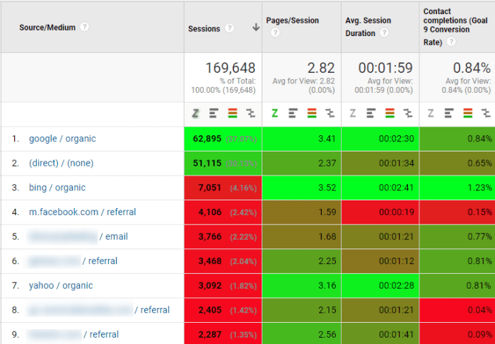
Here is an example where we the best traffic source by conversion rate is marked with bright green: bing / organic which has a conv. rate of 1.23% much higher vs. the avg. 0.84%.

binggg

4.  Check Google algorithm updates impact on traffic

Suggested tool: Panguin (free)

With this tool you can find out if the latest Google algorithm update had any effects on your website.

panguin-tool


Google Data Studio – My first Demo Reports (with examples on how to use the tool)

header-google-data-studio-reports

Est. reading time: 10 minutes.

I have found out about the Google Data Studio Beta on 24 May ’16 on the Google Performance Summit showing Google Ads & Analytics Innovations.

If you have time and want to view the event, the recording is on youtube.

icon-playClick here to skip to the part related to Google Data Studio.

My first Demo Reports

I decided to share my first demo report via Twitter.

Didn’t expect the first demo report to generate a lot of interest but it seems it was noticed and retweeted on the Google Analytics twitter page.

After using more options I made a new demo report with additional data:

  1. Filters to explore specific dimensions.
  2. Time graph with 3 metrics.
  3. Multiple dimensions on a table to identify specific sources.

demo-report-data-studio

eye Click here to load the Demo Report in a new tab

This time I also made 2 examples on how to analyse the generated data

(the screenshots are generated also using Google Data Studio)

data-analysis-example-by-os-browser-data-studio

eye Click to see the screenshot in a new tab

data-analysis-example-by-traffic-source-data-studio

eye Click to see the screenshot in a new tab

I want to share with you some of the options in the tool that I think they can be useful for a data analysis project (and how to edit them).

1. See Changes over time

(Ex.: current week vs. previous week , current month vs. same month on last year)

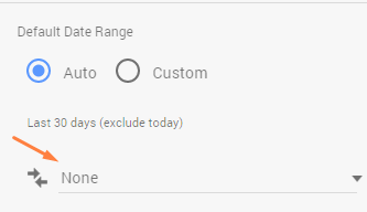
How to edit this option on a table

Note: If you are creating a new table you will see on the edit options on right when scrolling there is an option after Default Date Range showing “None”. Click on it to add the compare period.

compare-none

Below is an example with changes current period vs. same period last year and how it looks on a table.

changes

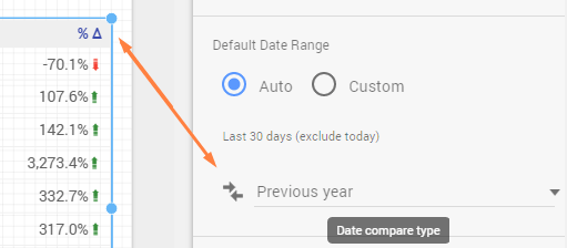
Another example on how it looks on a Scorecard after selecting Previous year.

Note: The change will show with a green or red number on a Scorecard.

scorecard-changes

(Ex.: the conv. rate improved by: +73.1% here.)
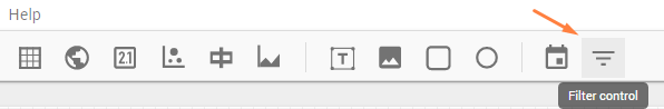
2. Filter controls filter-controls

Use filter controls if you have time to explore more details on your data.

Here is a 4 min. presentation from Google regarding the filter controls:

After clicking the Filter control button you will see that you can create a square or a rectangle that will be showing all the options selected by default.

filter-control-default.png

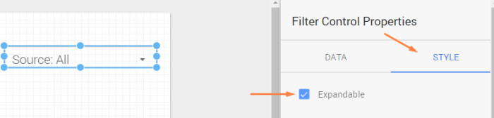
If you want you can change this default view state to a dropdown.

Go on the Filter Control Properties on right and choose Style.

filter-control-properties

icon-play Short recording here on how to do edit the multiple options on the properties.

3. Additional metrics and dimensions in tables.

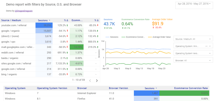
By adding more metrics and dimensions you can get more specific in your data analysis.

For example you could add in a table the dimensions: O.S. , O.S. version, Browser, Browser Version and the metric ecommerce conv. rate to identify the specific sources where you might have problems.

icon-play Recording with example here

Extra tip:

Increase the report width for more space

If  you need to increase the space on width to show more data in the first screen you can change this from File – Report and theme settings – Layout – and choose  Landscape.

icon-playRecording  here on how to do it.

file-theme

Resources list:

Google Data Studio 360: How to get Facebook, Bing & Twitter data in 3 minutes- Supermetrics-com

Google Data Studio: A Step-By-Step Guide – Online-Behavior.com

Showing off the new (free) Google Data Studio, with reddit April’s gilded comments for Sanders/Trump/Clinton in BigQuery – Felipe Hoffa

Interactive Guide from Google

Data Studio 360: First Steps  -AnalyticsPros.com

The users on Data Studio are limited to creating five reports per account but on Data Studio 360 they can make unlimited reports.

I hope you found the info useful.

What is your impression of Google Data Studio?

Leave a comment below.

The best Google Analytics Debugging Tools

debugging-examples-and-tips

Est. reading time: 20 minutes.

If you want to make sure you are tracking accurate data (or if you want to check if you have issues with the Google Analytics setup) this article is for you.

There are multiple ways where your analytics data can be inaccurate. You can fix some of the bugs, but others are beyond your control.

Actions based on incomplete or invalid data can have a negative impact on a business  and the number of missed opportunities can increase.

debug-importance

I have divided the tools suggestions by 2 categories based on their location:

inside GA and external.

Tools for debugging inside Google Analytics

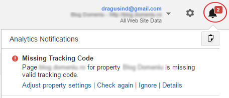
1. Google Analytics Diagnostics (inside the GA product).

Suggestion for: Everyone.

Google Analytics will check the configuration for common problems and sometimes it will report us the issues.

How you can use it for debugging:

Click on the bell icon on the top right corner to see if there are notifications triggered.

critical-notifications

Tip: Click on “Details” for each notification to learn more about it and to find possible solutions.

Learn more about the diagnostics messages here.

Limits

  • You have to wait for the issues to appear after data is collected.
  • It will tell us if an issue was fixed or not only after collecting more data.( Crawl frequency varies)

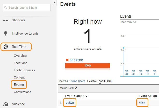
2. Real-time Reports  (inside the GA product). 

Suggested for: Everyone

Real-time Reports are great for testing.

I use them to check the triggers for the tracking code, goals, events or virtual pageviews.

How you can use it for debugging

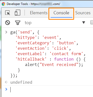
This is an example where a link event is recorded ok.

I selected a page where I have the Google Analytics tracking code installed and also an event on a link. After clicking on the link with the event I went in GA on the “Reports” section > Real Time > Events to see if the event was triggered.

realtime-reports-event-test

These 2 sections inside Google Analytics are useful but for a full debugging I suggest using other external tools.

External tools for debugging GA 

1. Google Tag Assistant (Chrome Extension)

Google-Tag-Assistant

Suggestion for: Everyone.

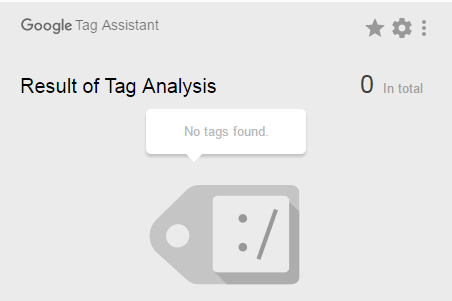
This tool helps you check if  the tracking tags are installed correctly on your pages (not just GA). You can debug Google Analytics Tracking Code (GATC), Google Tag Manager (GTM), and Adwords Conversion Tracking.

How you can use Tag Assistant for debugging:

I will show you some examples with notifications that may or may not appear.
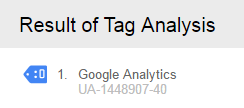
1. “No tags found”.

tag-assistant-no-tags-found

Solution:  Add the Google Analytics tag in the website source code. (Even if it seems obvious, some people forget to do this.)

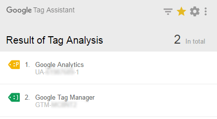
2. “Code found outside of <head> tag.”

notification-blue-tag

ga-tracking-code-outside-head

Solution: Move the tracking code inside the <head> tag. (This is the recommended location of the from Google)

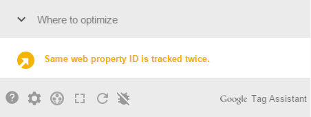
3. “Same Web Property ID is tracked twice.”

same-property-id-tracked-twice

tag-assistant-multiple-codes

Solution: It is recommended that you keep only one tracking code.

This notification usually means you are using 2 instances of the same tracking code on the website.

Scenario example for this case: you could have the tracking code added in Tag Manager but also from another source (like a plugin; Ex.: Yoast).

If you want to see more information about Google Tag Assistant check this video:

There is also a video from Google showing how to use the recording function.

     Limits:

  • It can’t check all the tags that don’t fire (as they are either broken or waiting for an event to occur first)
  • It can’t scan all the pages from the website automatically.

Tip for checking tags:

Besides checking your website/s, you can also check other websites to see what kind of tags they are using. You can check for example if a website has a remarketing tag.

remarketing-tag

Besides checking the Google tags you can use another extension like “Ghostery” or “Builtwith” to check other tags.

2. GA Checker (online web tool)

Suggestion for: Everyone.

This online tool can check the presence of the GA code on multiple pages of a website.

Limit: Analyse up to 10,000 Pages.

How you can use GA Checker:

Just add your website address and wait for it to scan the pages for the tracking code.

The tool can scan a website for the presence of the following tags:

  • Google Analytics (ga.js)
  • Google Analytics Remarketing (dc.js)
  • Google Universal Analytics (analytics.js)
  • Google Analytics Experiments (ga_exp.js)
  • Google Tag Manager (gtm.js)
  • Google AdWords Conversion (conversion.js)
  • Google AdWords Phone Conversion (loader.js)
  • Google AdWords Remarketing (conversion.js)
  • Google AdWords Dynamic Remarketing (conversion.js)
  • Google DoubleClick

3.  Google Sheets or Excel to make a Health check report

Suggestion for: Everyone.

I suggest using a tool like Google Sheets or Excel to make a health check report for monitoring the implementation and to know exactly what the status is on your data.

Tip: If you want to find out details about making a health check report I suggest reading the book  “Successful Analytics” by Brian Clifton.

Suggestions for intermediate and advanced users

4.  Chrome Developer tools (tool inside Google Chrome)

If you have Google Chrome you can activate this tool with the shortcut: CTRL+SHIFT+ I (without installing anything else)

Events testing example:

Make sure you are in the “Console” tab and add the code below if you are using Universal Analytics code (analytics.js)

console-event-code

If the event tracking works ok you will get this alert box:event-confirmation-screen

If the event tracking doesn’t work you could get an error like this one:

ga-console-not-defined-error.png

The code used for testing events (the Universal Analytics format):

ga('send', {
  'hitType': 'event',         
  'eventCategory': 'button', 
  'eventAction': 'click',     
  'eventLabel': 'contact form',
  'hitCallback' : function () {
      alert("Event received");
   }
});

5. GA Debugger (Chrome extension)

google-analytics-debugger

By activating this extension and using it with Developer Tools, you can test adding a new code without uploading it to the server.

New event code testing scenario

On Chrome, load the page where you want to test adding a code for an event.

Right click on the link and select “Inspect element”.

Click on “Preserve Log” and add the code event.

After you will click on the link, new event data should show on the Developer Tools Console.

6. Screaming Frog (desktop software currently at £99)

screaming-frog

If GA checker isn’t enough for your website, you could try a paid alternative like Screaming Frog.

How you can use Screaming Frog:

There are articles on the web on how to check the tracking code on multiple pages using this tool: Check the tutorial from Insideonline  or the one from Seerinteractive

7. Fiddler (free desktop software)

How you can use Fiddler

Install and open Fiddler, type website URL in the box on the bottom of the software screen and press enter.

*Note: I have installed Fiddler 2 on my PC (because I have Win 7).

fiddler-domain-name


Select the sessions with the host “www.google-analytics.com” and choose “Inspectors” and “WebForms”.

fiddler-virtual-pageview.png

If you want, you can use the “Filters” tab and select “www.google-analytics.com” to show only GA data.

filters-fiddler-ga

How an event is reported for Classic analytics (ga.js)

fiddler-events

How an event is reported for Universal Analytics (analytics.js)

universal-analytics-fiddler-event

There is also a video tutorial on youtube:


Book Review – Google Analytics Demystified: A Hands-on Approach by Joel J.Davis  (second edition)

google-analytics-demystified-book

The book has over 700 pages (which may seem a lot at first sight for some people) but I think this is not a reason to worry. (For reference purposes I placed in the image above a smaller book: “Delivering Happiness: A Path to Profits, Passion, and Purpose” which has 272 pages.)

The content is not overly technical and is quite easy to understand and follow. There are many pages that contain images with tables and graphs from Universal Analytics. I think the screens are useful for new users of the tool and they should help the readers to understand the concepts being discussed.

The author encourages the reader to become an active participant and apply the key concepts from the book by including chapter review questions, exercises and a free downloadable website. (The website is a fictitious travel agency.) Using a website demo when a new user wants to implement something new is a good approach because this way he can better understand the key concepts without the risk of damaging a real website.

Some of the books I have read don’t have the content updated to reflect recent changes in Universal Analytics. This is not the case for the second edition of this book: the content (released in July 2015) is updated for Universal Analytics and includes topics like:

  • cohort analysis
  • benchmarking
  • custom tables
  • tree maps

The book, however, does not address Google Tag Manager.

(There are other books on Amazon and online resources that discuss Tag Manager for those who are interested in taking this approach.)

While a wide range of topics are discussed, the topics that caught my attention were the events regarding video monitoring, form completion monitoring and page scroll. These are not in the standard configuration of Universal Analytics and I liked that the author included them in the book.

To summarize, I believe the book is a good starting point for people who are new to this tool (and it should provide a good reference for those who are already familiar with Google Analytics.

If you are interested in the book you can buy it from Amazon here.

Google Analytics Quiz

Test your GA skills or prepare for GAIQ Certification

GA Quiz

Note: This Quiz doesn’t have a time limit.

The questions from the certification can be different than the ones from this quiz.

  • The official Google Analytics Exam has 70 questions that need to be completed in 90 minutes (You cannot pause the official Exam).
  • That means aprox. 77 seconds per question.
  • The passing score is 80% and it’s good for 18 months.

analytics-exam